Chart Showing Income Disparities By Ethnicity Is Misleading


The Claim
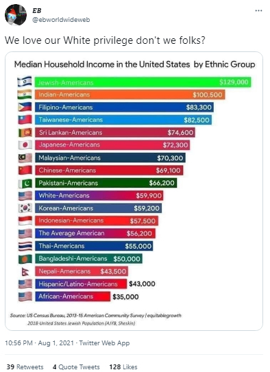
A viral chart of the household income differences between ethnicities within America shows that white Americans are on the lower end of the income spectrum, disputing the existence of white privilege.
News posted on


Emerging story
A chart claiming to show the differences in income among American households by race has been circulating on social media since last year. Some have used this chart in an attempt to disprove the concept of “white privilege,” as it appears to show that white Americans are at a lower income bracket than many other demographics.
This chart has managed to gain hundreds and in some instances thousands, of interactions on social media.

Misbar’s Analysis
Misbar’s investigation found this chart and its accompanying claims to be misleading. First, next to specific ethnic groups, the chart includes the category of “The Average American,” which is not an ethnic group and is not further explained or defined.
The chart also skews the data due to one ethnic group, Asian Americans, being overly divided. Indian Americans, Filipino Americans, Sri Lankan Americans, Japanese Americans, and so on are divided into different groups. But white Americans are not divided into English Americans, German Americans, Irish Americans, and so on.
Additionally, the chart is not reflective of the overall U.S. population, which provides a broader picture of income divides. According to the U.S. Census data, only 5.9% of the US population is made up of Asian Americans. Once Asian Americans are put into a singular demographic group, the income advantage over white Americans is less significant. In 2017, the median household income in the U.S. for Asian families was $81,331, and for white families, it was $68,145.
The chart also does not take into account the geographic locations of the different demographics represented on the chart. As the Washington Post highlights, the cost of living varies significantly within different areas of the U.S., with white Americans and African Americans being more likely to live in cheaper parts of the country. However, 97% of Asian Americans live either within or nearby a city, which has a higher cost of living.
And the chart does not disprove the idea of white privilege, due to factors that are separate from income. For instance, victims of police brutality are more likely to be people of color. Privilege can be measured in more ways than income.
While its source appears to be a reputable organization, we could not locate the chart on their site.